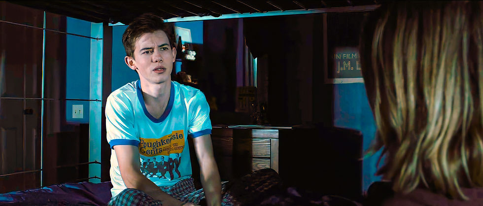
Tony was my first experience with a bio pic. In this case a glimpse into the early life of Chef, Author and TV Host Anthony Bourdain. As Bourdain is a highly respected figure and admired by many it was crucial to portray the environment in an accurate and sensitive way. Getting to work with Production Designer Ryan W Smith again (The Holdovers) was a pleasure. He allows me latitude to dig out nuggets of gold hidden in the script and explore the details to bring out a richer experience. Part of my responsibility on the film was to be "the hand" of Tony, as he was noted as an illustrator and frequently used his talent to exhibit his feelings. There was little to examine of his early works as a reference to base the illustrations the script called for on, so I took what I had and did my best to simulate his style. Most notably his drawings of an idea for a Flagship Sign and a Clambake flier, which was based on a flier Bourdain did when he was a teen. The story takes place in the mid 70's so I find myself again in familiar territory. Yearbooks, signs and posters were a special treat as I take much inspiration for my own work from the era. And getting to design Bruce Lee movie posters... what 70's kid wouldn't geek out over that? Bringing modern day Provincetown back several decades was an exercise in research and interpolation. Using what was known to exist and rolling back what was there to an older time was a fun challenge. Creating several vintage pages for the French Cookbook was probably the biggest design challenge. Transcribing the text, designing period illustrations and matching the existing pages was a team effort with the Art and Props contributing. The seemingly banal detail of a simple menu becomes important to ground the film in it's time and place with the simplicity of design and even showing how far removed we are from a 7$ lobster roll. There were several moments in the final cut that give me satisfaction as a designer. The stained glass in the church, the inspirational painting in the Flagship Kitchen and the inserts of my illustrations make all the hard work pay off. The film itself is a well-crafted homage and time capsule to a simpler time and is a favorite of my projects among my circle. Particularly striking a chord for it's authenticity and performances.


I worked on Alexander Payne's The Holdovers off and on for nearly two years. It is by far my most immersive experience in the making of a film including filming, post production, marketing and the design of the artwork for the soundtrack and a one sheet poster. My first task was creating a brand for our fictional school, Barton Academy. While the Boston locations provided a lived-in backdrop, we needed to make the place a character in itself. The script called for an academy that was founded in the 18th century, so I felt we needed to show some visual progression, in the crest in particular. This version is meant to give the feel that it was created sometime around the turn of the 20th century. I then created a more mid-century version that we used on test books, code of conduct and flyers. The mascot was also a big player. I wanted something that felt real in the space and emitted the right energy for an institution that prepped young men to be leaders. His derisive snort is my favorite feature. The carved dedication to war heroes in the chapel wall was something I did digitally in post production, along with the memorials carved into the chapel stones. The signs, pennants and banners needed to be period accurate and add to the rigid environment we were creating. The flyers, while only atmosphere were a fun playground to inject some callbacks to other projects and hide some Easter eggs.


Angus Tully has his secrets. Among them are his affinity for Zap Comics and a little smut. I wanted to make my own skin mag for Tully to be sneaking a peek at. Alexander wanted it to be more trashy than mainstream. I found some saucy ladies for the cover and did some extensive research on smut mags of the time to get my cover art. DENT was born. The Kinky Tale within I wrote myself. The updated Barton seal is on his notebook. The photo of the Tullys holds another secret. While initially done during production, this is another element that was created digitally in post production. The hospital pharmacy was a fun project. I designed the sign which was built by a Prop Shop. The flyers and signs that go with it are modeled after actual pieces from the era. With a keen eye you can see my name on the Pharmacist placard. Very often in my work I need to go beyond the basic design of elements and need to create composites to inform the Art Department how the elements I create are meant to work in those spaces. The Christmas Tree lot was one of those situations. The design of some bespoke looking pieces created a nice contrast to the situation and ended up being one of my favorite moments in the movie. The Salon and TV Repair shop is an example of creating a set digitally and providing a road map for the decorators. This was a personal set for both the director and the production designer. I had to make sure it delivered. The flyers, ads and window graphics were all thoughtfully designed. The nail salon was a personal project for me. It is a tribute to my mom and my neighborhood. A period liquor store is always going to be a challenge. We were fortunate in finding accurate labels and getting permission to display real brands, but there is always need for the personal touch. The stripes on the cooler were designed to give the tiny space some movement and color. The stripes are misaligned purposefully to back up the nature of Tully and Mr. Hunham's growing friendship.


Getting the environment outside the academy right was challenging. It was important for us to create the vibe that this was a working class area, but not so run down that it seemed too old to be the 1970's. The Winning Ticket we made from the ground up. The sign is one of my favorites. It looks like it has been there for a decade. The Boston area gave us a lot. We needed to dress it for dinner though. Some period signage, taxi cabs and digital coverups brought the scenes to the next level. Devin's Dungeon is another post FX. The owner of the shop on location wasn't too helpful the days we were filming, so what better than to turn the place into an adult bookstore. Too Hot For Sweden! The Panty Hose ad was Alexander's idea and I ran with it... The scenes in the State Hospital where Tully connects with his father are powerful and needed an austere look. The signs are simple and to the point. This was a particular favorite of designer Ryan W. Smith. Ryan is a pleasure to work with. He is open to ideas and having worked together before, albeit short-lived, we were efficient in dialing in the look and feel that Alexander wanted for the film. Items made as props require a bit more attention. The pill bottles I knew would be seen up close, so extra care was taken to make them ready for their close up. More Easter eggs here, not least is Hertzels Pharmacy. A callback to About Schmidt. Meditations was something that went through some evolution. Mr. Hunham's go to holiday gift had to look great up close, but we also wanted to give the character a splash of playfulness with a colorful cover art. This was a nice moment in the film that displays the cohesion of the primary characters.


The Lost City, originally titled The Lost City of D, is a sprawling romantic adventure that begins in Los Angeles and climaxes in the jungle of the fictional Isla Hundida off the coast of northern Africa. While admittedly you don't find alot graphics in the jungle, we did manage to drench the civilized world portions with a dizzying array of graphics. The convention where Loretta Sage debuts her book near the beginning of the film represents the bulk of my work on the film. Getting the finished look for the 'The Lost City of D' took several weeks to get dialed in on it's own. The book jackets, posters, table aprons and bookmarks for a dozen or more books on display at the convention added quite a load. Each book was carefully considered, titled, covers designed, with synopses written and reviews concocted. I became quite the blurb writer for books that don't exist. I went beyond blurbs when an insert shot of Loretta's book is front and center. I penned six original pages to anchor the symbols that are referenced. Some steamy stuff on those pages. Loretta's smart watch is an original design which I also animated. Rights usage and clearances has become a major part of providing background to a scene. Whether it's a map, or 10 maps, or airlines, bookspines... anything that someone else created either needs to be cleared for use, altered substantially or just plain made from scratch to look similar. Maps are a big part of this. Several maps from various time periods needed to be created for our fictitious island. Phone apps and screens need to be created and animated. You can see in the background of Loretta's publisher's home, photos, book jackets, awards etc. All these things need to be created. We also needed an airline. A name was chosen, logos created, signs, tickets and brochures designed as well as arrivals and departures and booking software. The bulk of which you will never see. Fortunately for you I have provided a few closer looks at some of what you missed. The penultimate scene in the film finds Loretta and Alan embracing on a rock after a harrowing adventure. The scene wipes away to reveal the cover of the latest Sage masterpiece. Take a closer look.


Being a native Nebraskan I had been exposed to small town living from an early age, so getting dialed in to the fictional town of Hawthorne was not difficult. Making designs work in Black and White was not so simple. Payne's desire to make a stark, basic film was only augmented by going black and white. However, shooting digitally and then dropping the color meant experimenting with the colors and contrast levels. In color, many of the shots looked quite bizarre, and sometimes jarring. Ultimately it turned out to be one of the most beautiful films I've seen. The My Million Dollars letter was THE PROP. It needed to look official to Woody and a joke to those who thought him a fool. The signs of Hawthorne were so unique and sort of succinct to the location. We kept stripping away more and more until we got to the bare minimum of what was needed. Many of the actual signs from the town were left as is, so blending in what we added to the existing was even more important than making them look good in B&W. I worked with the talented scenic artists to get a perfect finish. Dennis Washington is an incredible illustrator. His sketches were ever present and it was amazing to watch him work. The Hawthorne Republican newspaper was quite a project. The scripted action required me to create eight full pages of vintage newspaper, including copywriting several articles so that any closeup shots would look authentic and be filled with actual stories. An early version of Woody's Prize Winner trucker hat appears on the show logo. Color shots of "Hawthorne" courtesy of location scout Jamie Vesay.


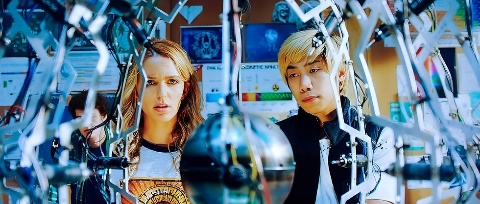
Working a sequel is always difficult. Matching the tone and look of an existing production can be restrictive and kind of a bummer really. This movie was not like that. Landon wanted to create an alternate reality to the original and gave us room to play. We had to adhere to the established looks, but were encouraged to create probable variations. There were new locations in 2 , such as the Lab and the Gymnasium. The Lab had alot going on so we really wanted to make it memorable. The blue sprialing mural blended into the sci-fi, time-bending elements of the film and really came to life when the Dean gets blown across the room. The gymnasium was a huge set. We wanted it to be lousy with school spirit. As they are the Bayfield Babies I named it The Cradle. I teamed up with our costumer for the team uniforms, and also for creating a custom pattern for the Dean's tie. The alternate reality angle of this film turned out to be quite fun. Tree's shirt matches the original, but the bands are different. Landon wanted to pay homage to Back to the Future in the set dressing, so we added an alternate movie poster on the dorm wall. We took it to the next level by replacing Michael J Fox on the title block with Eric Stoltz, the original Marty McFly. Tree's death montage was like a candy store for me. She chugs my Liquid Python Drain Cleaner in one scene... which has appeared in other films since. As well as it's parent company... Pluggo. She dives out of a skydiving plane with Like a Leaf in the background (her name is Tree...) The corrugated bulkhead wall and door are all part of the graphic. In another B2F nod, and another pun, Tree leaps into a shredder belonging to Biff's Tree service. Make like a Tree, and get out of here.



The High School in Tall Girl created as many challenges as it did opportunities. The sheer scale of the space and high ceilings meant we had to be bold with the graphics package. We moved away from the typical mascot driven look and instead went with a more basic look to accent the walls and shrink the space. More intricate photographic signage was placed throughout and placed high to reinforce the feeling of towering above everyone. A playbill for the musical Roux ga Roux in Jody's room refers to a Louisiana folk tale about a werewolf. Something she relates to as something of an outcast herself. We had to give her some original literature. Bill Boes' dog appears on one cover. We felt that Dunkleman was going to have some unusual tastes and wanted to reinforce that idea by populating his bedroom with obscure imagery. Foreign movie posters, some local color with vintage jazz flyers and quirky albums. We wanted to focus on this quirk by making an album cover into his pajama shirt. Designing these was an absolute pleasure. The final prints were placed in vintage album sleeves with real pricetags to complete the illusion. The comics were also a blast. One of them is about a tiny hero who fights against insect-borne allergans. The Welles Style movie poster in Japanese is titled the Jilted Man, referring to Dunkleman himself as he has been consistenly cast aside by the focus of his affections. Jodie Grandefille (Tall Girl in French) stars in The Girl with all the Birds. One of the Jazz Posters features Chartreuse Dunkleman, presumably his Grandmother.